역대 수상작
게시물 보기
|
|||
| 수상명 | 추천 | ||
|---|---|---|---|
| 출품명 | Layers of illusion | ||
| TITLE | Layers of illusion | ||
| 출품자 | 서윤정 | 이메일 | e505e@hanmail.net |
| 출품부문 | 제품 텍스타일/소재 |
출품자구분 | 추천디자이너 |
| 접수번호 | 18RPR0117 | 조회수 | 962 |
| 출품설명 | |||
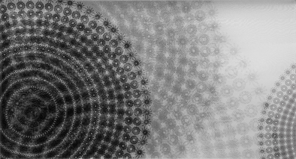
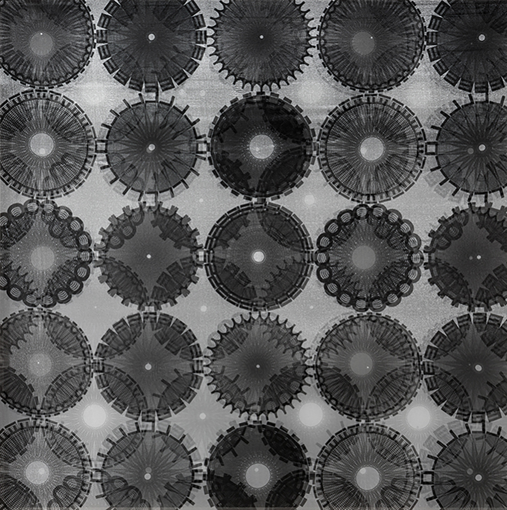
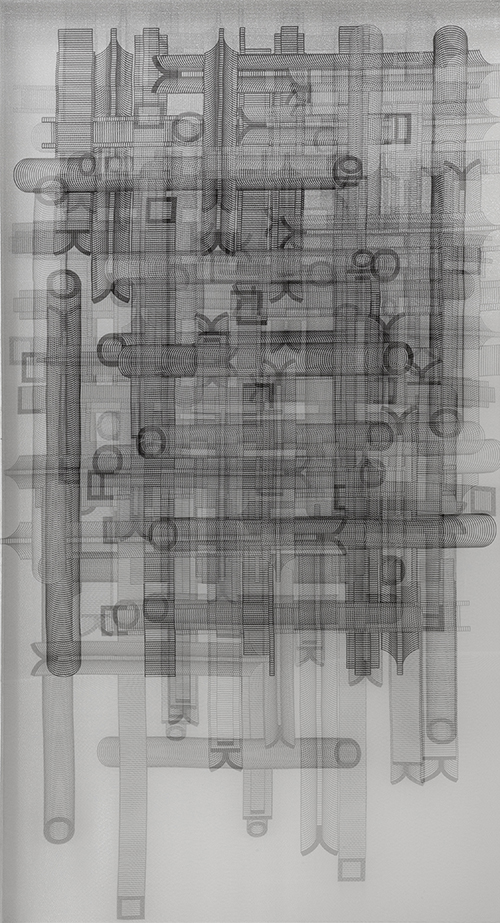
| 본 작품은 한글 패턴 작품의 구조에서 문자의 입체성을 비롯해 중첩과 반복에 대한 디자인이다. 한글의 구조가 지닌 시각적 효과도 중요했지만 한글이 지닌 문자의 특수성 역시 중요한 문제였다. 한글은 표음문자로서 우리의 구강구조와도 밀접한 관계를 가지고 있다. 제품에 나타난 한글 모티브의 배치와 구성에 의해서 나타나는 공명성과 율동성은 매우 중요한 의미를 지닌다. 한글의 확장성과 자기유사성은 일정한 반복에 의해 새로운 모티브가 생성되는 평면적 패턴에서의 공명성으로 나타난다. 또한 반투명 오간자의 물성에 내재되어있는 모아레 현상은 한글의 공명성과 결합하여 한글의 시·감각을 증폭시켜준다. | |||
| DESCRIPTION | |||
| The main purpose of the study is to analyze the overlay and repetition including character’s stereoscopic feature in the structure for the researcher's Hangul pattern works. The visual effect of the Hangul structure was important, but the specificity of the Hangul characters was also an important topic. Hangul is a phonetic alphabet, closely related to our oral structure. The resonance and rhythm occurring from the placement and composition of the Korean motifs were very important issues of the study. The expansion and self-similarity of Hangeul were expressed as resonance in a planar pattern where new motifs are generated by constant repetit | |||
