역대 수상작
게시물 보기
|
|||
| 수상명 | Finalist | ||
|---|---|---|---|
| 출품명 | 국립어린이박물관 브랜딩 | ||
| TITLE | Children s museum of Korea | ||
| 출품자 | 박혜송 | 이메일 | hsparkjj@naver.com |
| 출품부문 | 커뮤니케이션 기업/브랜드아이덴티티 |
출품자구분 | 학생 |
| 접수번호 | 18SVC0571 | 조회수 | 764 |
| 출품설명 | |||
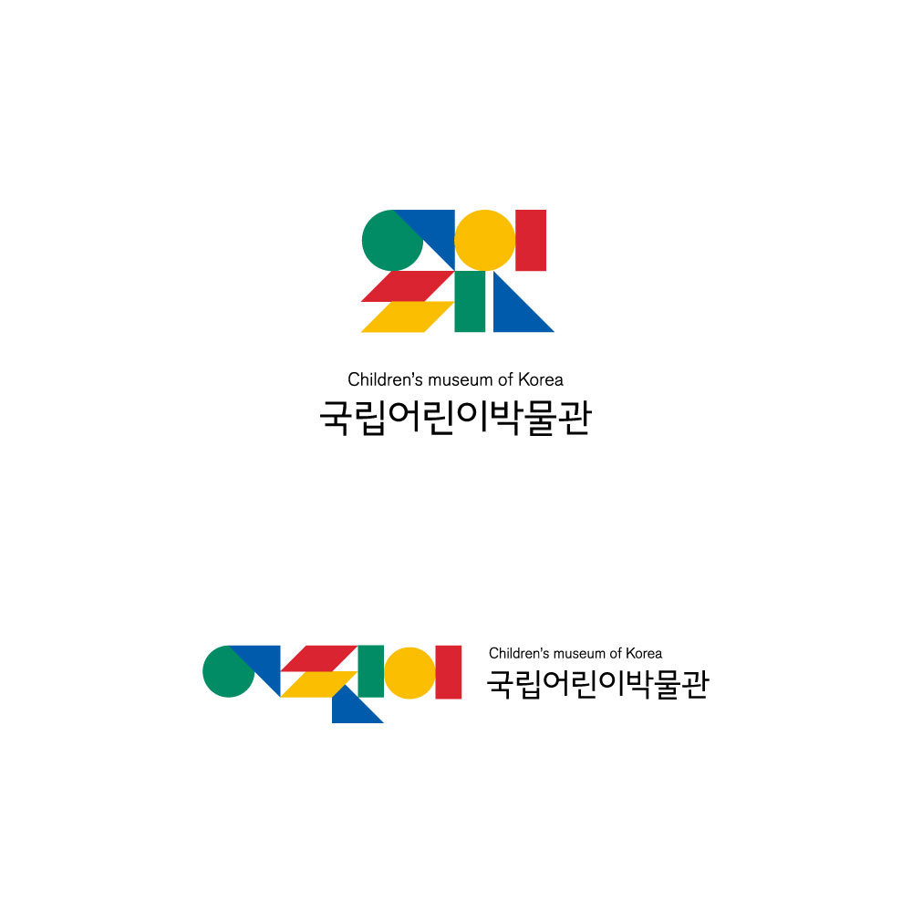
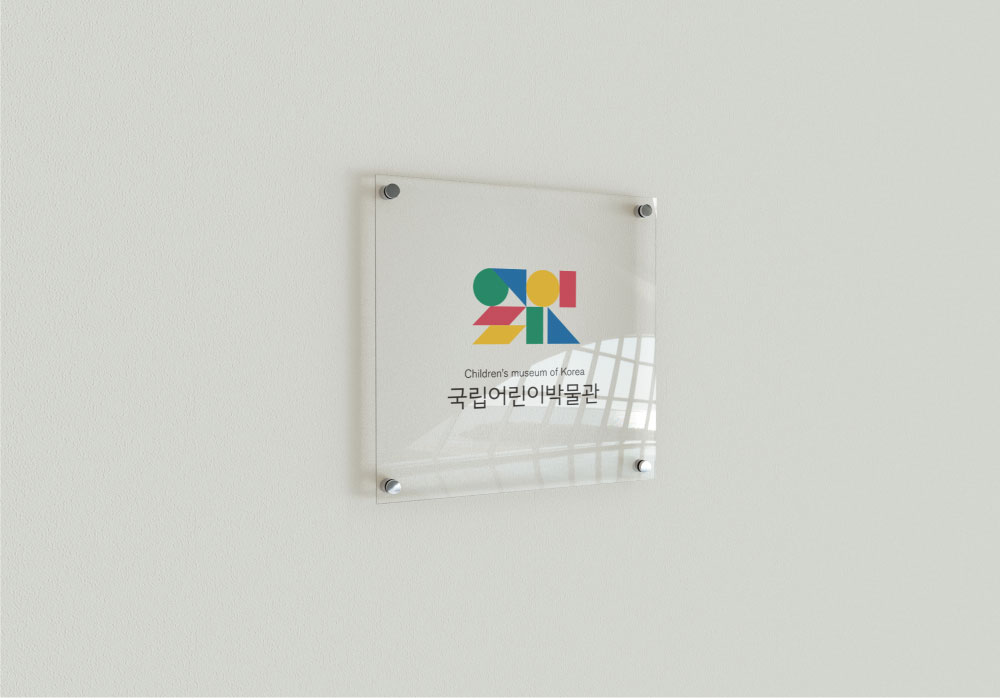
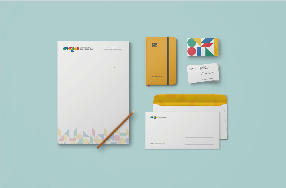
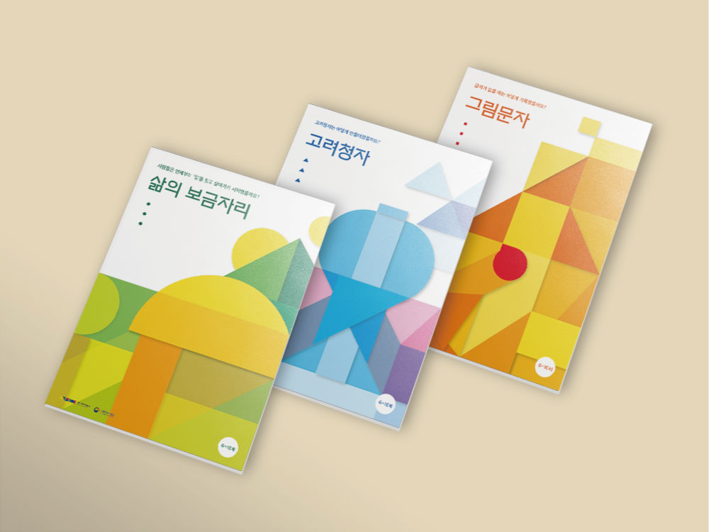
| 국립중앙박물관 소속 어린이 박물관은 어린이들이 직접 체험과 놀이를 통해 배우는 체험식 박물관입니다. 이러한 특성에서 ‘놀이’와 ‘학습’을 결합한 메타포를 이미지로 사용하고자 했으며, 우리나라는 대표하는 박물관 소속인 만큼 한국적인 느낌을 내고자 하였습니다. 따라서 우리나라의 전통 놀이인 ‘칠교’에 영감을 얻어 로고 및 패턴을 디자인 하였습니다. 이 로고와 패턴을 적용시켜 명함, 봉투, 수첩 뿐만 아니라 박물관에서 진행하는 학습 프로그램의 교재 표지 또한 디자인 하였습니다. 전반적인 색은 아이들과 어울리면서 한국적인 색채를 가지도록 제작하여 클라이언트인 ‘국립어린이박물관’의 의미를 시각적으로 전달하고자 하였습니다. | |||
| DESCRIPTION | |||
| The Children's Museum belonging to the National Museum of Korea is a hands-on museum that children learn through hands-on experience and play. From these characteristics, I tried to use metaphor that combines 'play' and 'learning', and this museum is a representative museum of Korea, so I wanted to represent Korean. Therefore, I designed logos and patterns with the inspiration of 'Chil-Kyo', a traditional play of Korea. This logo and pattern are applied to design not only business cards, envelopes, notebooks but also textbooks for learning programs in museum. The overall color was designed to have colors that match children and Korea. | |||
