역대 수상작
게시물 보기
|
|||
| 수상명 | 특선 | ||
|---|---|---|---|
| 출품명 | 감성 아이콘 | ||
| TITLE | Emotional Icons | ||
| 출품자 | 정혜원 | 이메일 | hyewon78.jung@samsung.com |
| 출품부문 | 시각디자인 | 출품자구분 | 프로 |
| 접수번호 | 10AV0278 | 조회수 | 1124 |
| 출품설명 | |||
|
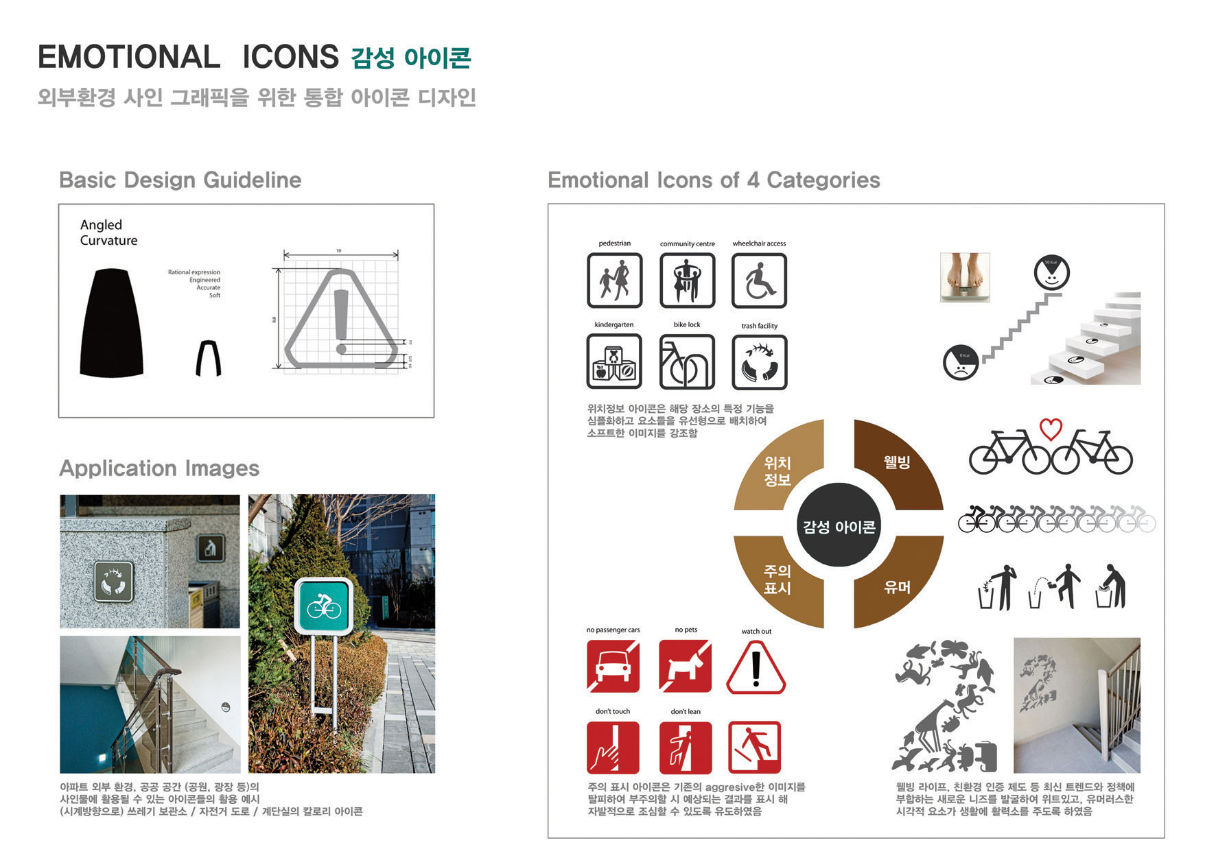
감성 아이콘은 아파트 환경이나 공공 공간에 설치되는 사인물의 아이콘들을 재미있고 위트있는 디자인 언어로 일관되게 디자인한 것이다. 그동안 사인 그래픽들은 정보전달 위주로 하드한 형태와 강한 색으로 디자인 되었지만 감성 아이콘은 보행자들에게 친근한 이미지를 전달하고 더불어 자발적인 행동을 유도하는 것이 목적이다. 아이콘의 형태적 컨셉은 'Angled curvature'로 소프트한 형태를 유지하면서도 코너에 약간의 edge를 주어 스타일리쉬한 이미지와 동시에 가독성을 표현하였다. 위치정보 / 주의표시 / 웰빙 / 유머 등 4가지 카테고리로 40여 가지의 아이콘이 통합 디자인되었으며, 기본형에 대한 가이드라인을 통해 향후 어플리케이션을 개발할 때 일관성을 유지할 수 있도록 하였다. 특히 자전거 전용 도로와 쓰레기 보관소, 계단실 등 친환경 트렌드에 부합하는 새로운 정보의 니즈를 재미있는 아이콘으로 표현하여 웰빙 생활의 동기부여가 될 수 있게 하였다. |
|||
| DESCRIPTION | |||
|
'The Emotional Icons' is a group of funny and witty icons expressed on the signs installed in apartment environment and public space. Graphics on signs usually involved stiff shapes and strong colors to strengthen communications, but emotional icons were designed to give a familiar image and lead spontaneous activities of pedestrians. A concept of shape is 'the angled curvature' which has not only soft shape but also a slight edge on the corner to express stylish image and readability. They consist of 4 categories ; location information, cautions, wellbeing and humor ; designed with a authentic concept for about 40 icons, and provide basic design guideline so enable to design new consistent applications in the future. Especially, eco-friendly and trendy items were included to motivate wellbeing life such as icons related to bicycle road, recycling zone and stairs case. |
|||