
역대 수상작
게시물 보기
|
|||
| 수상명 | Winner | ||
|---|---|---|---|
| 출품명 | 행복안경 | ||
| TITLE | Happy Glasses. | ||
| 출품자 | 이재용 조제욱 |
이메일 |
wodyddl15@naver.com wpdnrldi@naver.com |
| 출품부문 | 커뮤니케이션 광고/포스터 |
출품자구분 | 학생 |
| 접수번호 | 16SVC0547 | 조회수 | 1566 |
| 출품설명 | |||
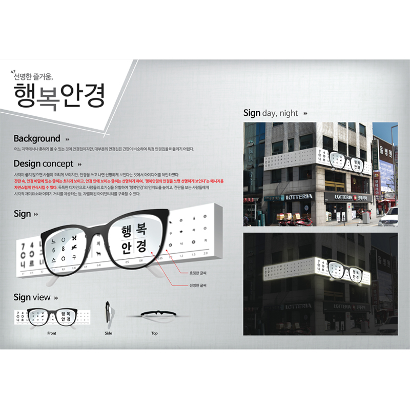
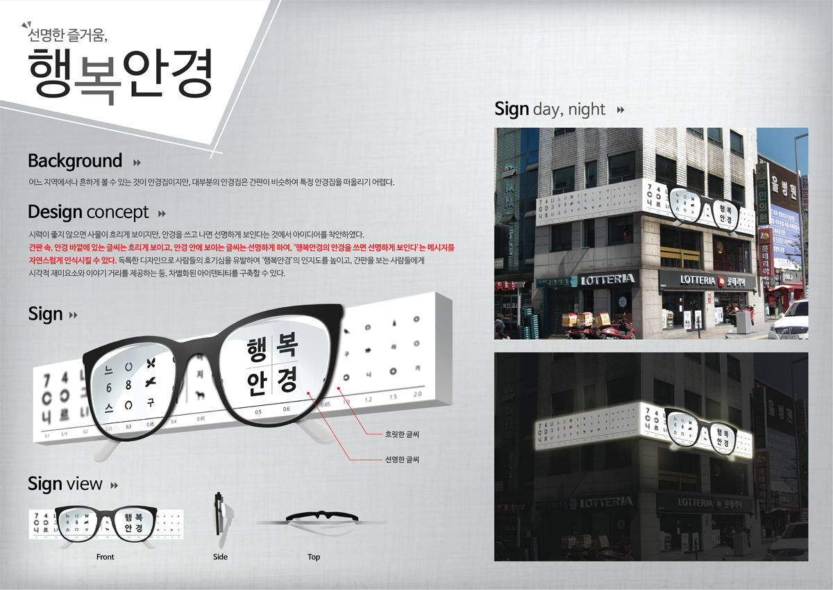
| 어느 지역에나 흔하게 볼 수 있는 것이 안경점이지만, 대부분의 안경집은 간판 등이 비슷하여 특정 안경집을 떠올리기 어렵다는 점을 문제로 규정하였습니다. 그러한 고민 끝에 발견한 것은 안경을 쓸 때와 벗었을 때 시력이 확연하게 차이가 난다는 것이었습니다. 간판에는 시력검사판과 안경을 융합하여 사람들에게 익숙하면서도 호기심을 유발할 수 있을만한 비주얼을 구상했습니다. 안경 안쪽의 글씨는 선명하게, 바깥쪽 글씨는 흐릿하게 하여 ‘행복안경’을 쓰면 선명하게 보인다는 메시지를 간판에 그대로 담아, 사람들에게 자연스럽게 인식시킬 수 있게 하였습니다. | |||
| DESCRIPTION | |||
| Optician’s can be found anywhere, but, most optician’s have similar signs meanwhile, it’s really hard to find some creative figurehead of optician’s which became problem as lack of special optician’s sign. So, we found that when people put on glasses or take off the glasses, it definitely has different visual acuity. So, we created sign which combined glasses and visual inspection plate which can be familiar and also can give some curiosity to people. The inside text of glasses indicated clearly whereas, other side text represented blurry which means people can naturally recognize that, if people using ‘Happy Glasses’, they can see everything | |||
