
역대 수상작
게시물 보기
|
|||
| 수상명 | Winner | ||
|---|---|---|---|
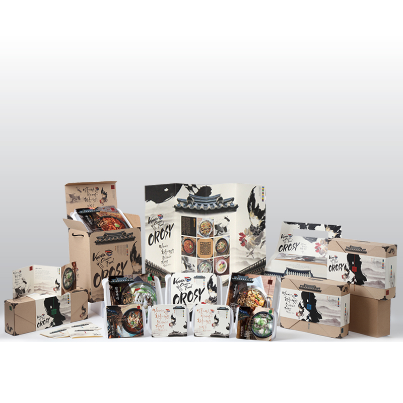
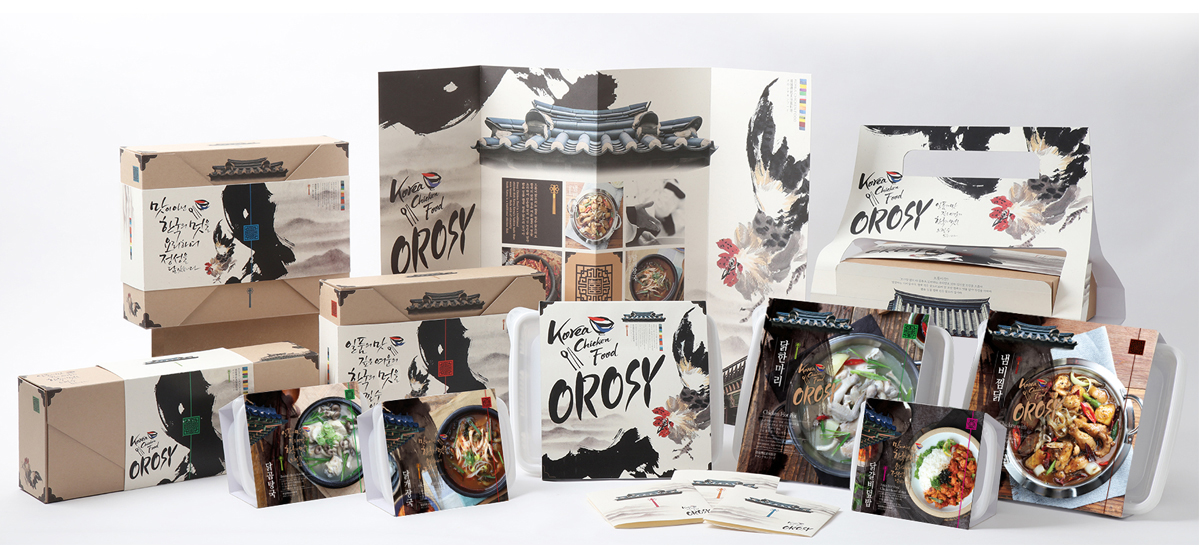
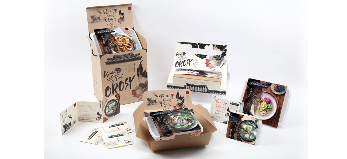
| 출품명 | 한식의 세계화에 맞추어 한국 전통 닭요리 해외수출을 위한 패키지디자인 연구 | ||
| TITLE | According to the Globalization of Korean Food Package Design for the traditional chicken exports Korea | ||
| 출품자 | 강지희 황용하 |
이메일 |
jiheedada@ddfnb.com gd200216@naver.com |
| 출품부문 | 패키지 패키지 |
출품자구분 | 프로 |
| 접수번호 | 16GPA0071 | 조회수 | 2002 |
| 출품설명 | |||
| 최근 한식의 세계화를 위해 한국 전통 음식을 해외시장에 알리고자 노력을 하고 있으나 음식의 품목이 제한적이며 한식의 세계화에 대한 어려움을 느끼고 있다. 본 디자인은 세계 어느 누구나 닭고기를 소비하고 있다고 착안하여 한국 전통 닭요리를 통해 한식의 세계화에 도움을 주고자 진행을 하였다. 오롯이의 네이밍 의미는 “모자람이 없이 다갖추고 있다”라는 우리말로 맛과 신선함을 오롯이 담았다는 의미이다. 디자인 컨셉은 한옥의 기와,닭의 이미지를 켈리그라피로 적용하여 한국의 정서를 표현하였고, 디자인에 한국의 맛과 정성을 담았다는 것을 보여주어 한국 전통 닭요리를 글로벌한 음식으로 자리매김 할 수 있도록 도움을 주고자 한다. | |||
| DESCRIPTION | |||
| This design was inspired by the progress that the world consumption of chicken anyone to help the Korea through the Korean traditional chicken globalization. Brand meaning of ohrotyi is "without lacking the features are" captured by Korean ohrotyi the flavor and freshness that are meaningful. The design concept is the hanok group, was representing the Korea sentiment by applying image of chicken with Kelly calligraphy, by showing that the design captured the taste and sincerity of Korea to establish itself in Korea traditional chicken dish in a global food It seeks to help. | |||